-
Matplotlib (2) - 산점도, 막대 그래프, 히스토그램파이썬 Python/데이터 분석 2022. 2. 16. 21:30
산점도
- 산점도(scatter graph)는 두 개의 요소로 이뤄진 데이터 집합의 관계를 시각화하는데 유용하다.
=> 키와 몸무게의 관계, 기온과 아이스크림 판매량과의 관계, 공부시간과 시험 점수와의 관계 등
키와 몸무게의 관계
from matplotlib import pyplot
import numpy

# 데이터 생성
height = [165, 177, 160, 180, 185, 155, 172]
weight = [62, 67, 55, 74, 90, 43, 64]

# 그래프 출력
pyplot.scatter(height, weight)
pyplot.xlabel("Height(cm)")
pyplot.ylabel("Weight(kg)")
pyplot.title("Height & Weight")
pyplot.grid(True)
pyplot.show()

# 원의 크기와 색상 지정
pyplot.scatter(height, weight, s=500, c='r')
pyplot.show()

# 데이터 별로 마커의 크기와 색상 지정
size = 100*numpy.arange(1, 8)
colors = ['r', 'g', 'b', 'c', 'm', 'k', 'y']
pyplot.scatter(height, weight, s=size, c=colors)
pyplot.show()
주요 도시의 인구밀도를 산점도로 표시
from matplotlib import pyplot
import numpy

# 데이터 생성
city = ['서울', '인천', '대전', '대구', '울산', '부산', '광주']
lat = [37.56, 37.45, 36.35, 35.87, 35.53, 35.18, 35.16]        # 위도
lng = [126.97, 126.70, 127.38, 128.60, 129.31, 129.07, 126.85] # 경도
pop_den = [16154, 2751, 2839, 2790, 1099, 4454, 2995]          # 인구밀도(명/km^2), 2017

# 그래프 출력
size = numpy.array(pop_den) * 0.2                     # 마커의 크기 지정
colors = ['r', 'g', 'b', 'c', 'm', 'k', 'y']          # 마커의 색상 지정
pyplot.scatter(lng, lat, s=size, c=colors, alpha=0.5) # alpha=0.5 : 반투명
pyplot.xlabel('경도 (longitude)')
pyplot.ylabel('위도 (latitude)')
pyplot.title('지역별 인구밀도(2017)')

# zip() : list 자료형 여러개를 결합해서, slice 하는 함수
print("zip(lng, lat, city) :", list(zip(lng, lat, city)))
for x, y, name in zip(lng, lat, city) :
    pyplot.text(x, y, name) # 위도와 경도에 맞게 도시이름 출력
pyplot.show()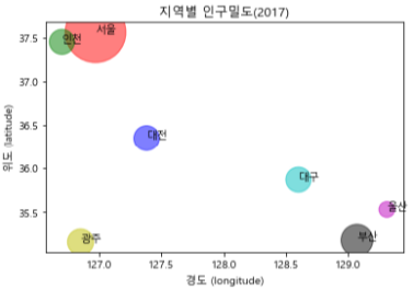
막대 그래프
- 막대 그래프(Bar Graph)는 값을 막대의 높이로 나타낸다.
- 여러 항목의 데이터를 서로 비교할 때 사용한다.
- 여러 항목의 수량이 많고 적음을 한눈에 알아볼 수 있다
회원 4명의 윗몸 일으키기 횟수 출력 : 운동 시작 전, 운동 한달 후 데이터 비교
from matplotlib import pyplot
import numpy

# 데이터 생성
member_IDs = ['m01', 'm02', 'm03', 'm04'] # 회원 ID
ex_before = [27, 35, 40, 33]              # 운동 시작 전
ex_after = [30, 38, 42, 37]               # 운동 한달 후

# 한글 설정
pyplot.rcParams['font.family'] = 'Malgun Gothic'

# 막대 그래프 출력
mem_num = len(member_IDs)     # 회원수 = 4
index = numpy.arange(mem_num) # 회원수만큼 numpy 배열 생성 = [0 1 2 3]
pyplot.bar(index, ex_before)
pyplot.show()

# 막대의 색상 지정
colors = ['r', 'g', 'b', 'c']
pyplot.bar(index, ex_before, width=0.6, color=colors, tick_label=member_IDs)
pyplot.show()

# 가로막대바 출력
pyplot.barh(index, ex_before, color=colors, tick_label=member_IDs)
pyplot.show()

# 막대바를 두개 같이 출력하기
# => align='edge' : 막대 그래프를 한쪽으로 치우치게 한다.
# => width = 0.4 : 두개의 막대 그래프가 들어 갈수 있도록 0.4로 지정
# => label='before' : 범례로 두 데이터를 구분하기 위해 문자열 지정
barWidth = 0.4
pyplot.bar(index, ex_before, width=barWidth, color='c', align='edge', label='before')

# index + 0.4 : ex_before 막대 그래프와 겹치지 않게, (x좌표 + 0.4)만큼 오른쪽으로 이동
# label='after' : 범례로 두 데이터를 구분하기 위해 문자열 지정
pyplot.bar(index + barWidth, ex_after, width=barWidth, color='m', align='edge', label='after')

# 범례 출력, 문자열 리스트 값이 없으면, bar(label='문자열') 값이 출력됨
pyplot.legend()

# 두개의 데이터를 그린 경우에는 tick_label 옵션을 이용해 tick 라벨을 변경할 수 없다.
pyplot.xticks(index + barWidth, member_IDs) # x축에 tick 라벨 출력
pyplot.xlabel("회원 ID")
pyplot.ylabel("윗몸일으키기 횟수")
pyplot.title("운동 시작 전과 후의 근지구력(복근) 변화 비교")
pyplot.show()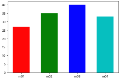


히스토그램
- 히스토그램(histogram)은 데이터를 정해진 간격으로 나눈 후, 그 간격 안에 들어간 데이터 개수를 막대로 표시한다.
- 데이터가 어떤 분포를 가지고 있는지 볼 때 사용. 주로 통계 분야에서 데이터가 어떻게 분포하는지 볼 때 많이 사용
- 히스토그램은 도수분포표를 막대 그래프로 시각화한 것이다.
from matplotlib import pyplot

# 데이터 생성
math = [76, 82, 84, 83, 90, 86, 85, 92, 72, 71, 100, 87, 81, 76, 94,
        78, 81, 60, 79, 69, 74, 87, 82, 68, 79]

# 한글 설정
pyplot.rcParams['font.family'] = 'Malgun Gothic'

# 기본 그래프 출력
pyplot.hist(math) # 기본적으로 변량을 10개의 계급으로 나눠서 표시
pyplot.show()

# 변량을 8개의 계급으로 나눠서 표시
pyplot.hist(math, bins=8)
pyplot.xlabel('시험 점수')
pyplot.ylabel('도수(frequency)')
pyplot.title('수학 시험의 히스토그램')
pyplot.grid()
pyplot.show()

'파이썬 Python > 데이터 분석' 카테고리의 다른 글
Matplotlib (3) - 파이 그래프, 상자 그림 (0) 2022.02.16 Matplotlib (1) - 그래프 (0) 2022.02.16 파이썬 확장 패키지 : numpy (2) (0) 2022.02.15 파이썬 확장 패키지 : numpy (1) (0) 2022.02.14 반복문 - while (0) 2022.02.09